This page is shown in Figure 1 and shows all the information relating to a selected  checklist.

 edit, delete or
  search the checklist; or to add new
  checklist items,attachments, comments, to the checklist.
The checklists name is displayed just below the top header area. The rest of the page is made up of a number of tabs or sections (depending on your selected view):
Note: If any tab is not immediately available at the view page, select the all tabs tab, and select the desired tab from this drop-down list.
checklist items,attachments, comments, to the checklist.
The checklists name is displayed just below the top header area. The rest of the page is made up of a number of tabs or sections (depending on your selected view):
Note: If any tab is not immediately available at the view page, select the all tabs tab, and select the desired tab from this drop-down list.
This tab shows an asset listing of all of the checklist items that have been added to this checklist, as shown in Figure 2. By default, this table will present you with a number of details about the checklist items such as it’s title, tooltip, field type default value, checklist item template, anser and comment. If you click on the title link of the listed checklist item, you will navigate to that checklist items view page.
From the Actions column of this checklist item table, you can act on individual checklist items by editing, deleting or  moving the chosen checklist item.
This tab will appear if the checklist is not a template. This is where you are able to fill out the checklist itself. The checklist items the are applicable will appear here to be filled out. 


This tab shows additional details for the selected checklist including the Checklist template id, whether or not this checklist is included as a tab or a dashlet, whether multiple of this checklist is allowed, classes which is the asset this applies to , the applicable workflow ID, and the object ID, as shown in Figure 8.
This tab shows shows some basic history of the checklist, as shown in Figure 9. By default, this tab will present you with a number of details about the checklist’s history such as the creation date, creation user, last update date and last update user. If the checklist has been changed then this section will also show a table of all the changes that has been made, including the date of each change, the field changed, the value before the change and the user who made the change.
This tab shows an asset listing of all of the comments that  users have made on this checklist, as shown in Figure 10. By default, this table will present you with a number of details about the comments such as, the date that this comment was last updated, who created the comment, the comment itself and any associated tags to name a few.
From the Actions column of this comments table, you can act on individual comments by editing or deleting the selected comment.
users have made on this checklist, as shown in Figure 10. By default, this table will present you with a number of details about the comments such as, the date that this comment was last updated, who created the comment, the comment itself and any associated tags to name a few.
From the Actions column of this comments table, you can act on individual comments by editing or deleting the selected comment.

This tab shows an asset listing of all of the attachments that have been added to this checklist, as shown in Figure 11. By default, this table will present you with a number of details about the attachments such as the file’s name, attachment type, view the version and access a download link.
From the Actions column of this attachments table, you can act on individual attachments by editing, deleting, moving or locking/ unlocking the selected attachment.

 checklist.
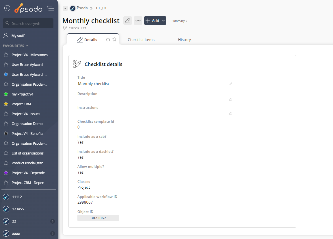
Figure 1 – Checklist view page
Depending on your access rights the top header area allows you to edit,
edit,  delete or
  search the checklist; or to add new
  checklist items,
 attachments,
  comments, to the checklist.
The checklists name is displayed just below the top header area. The rest of the page is made up of a number of tabs or sections (depending on your selected view):
Note: If any tab is not immediately available at the view page, select the all tabs tab, and select the desired tab from this drop-down list.
comments, to the checklist.
The checklists name is displayed just below the top header area. The rest of the page is made up of a number of tabs or sections (depending on your selected view):
Note: If any tab is not immediately available at the view page, select the all tabs tab, and select the desired tab from this drop-down list.
 Checklist items
This tab shows an asset listing of all of the checklist items that have been added to this checklist, as shown in Figure 2. By default, this table will present you with a number of details about the checklist items such as it’s title, tooltip, field type default value, checklist item template, anser and comment. If you click on the title link of the listed checklist item, you will navigate to that checklist items view page.
From the Actions column of this checklist item table, you can act on individual checklist items by editing, deleting or  moving the chosen checklist item.
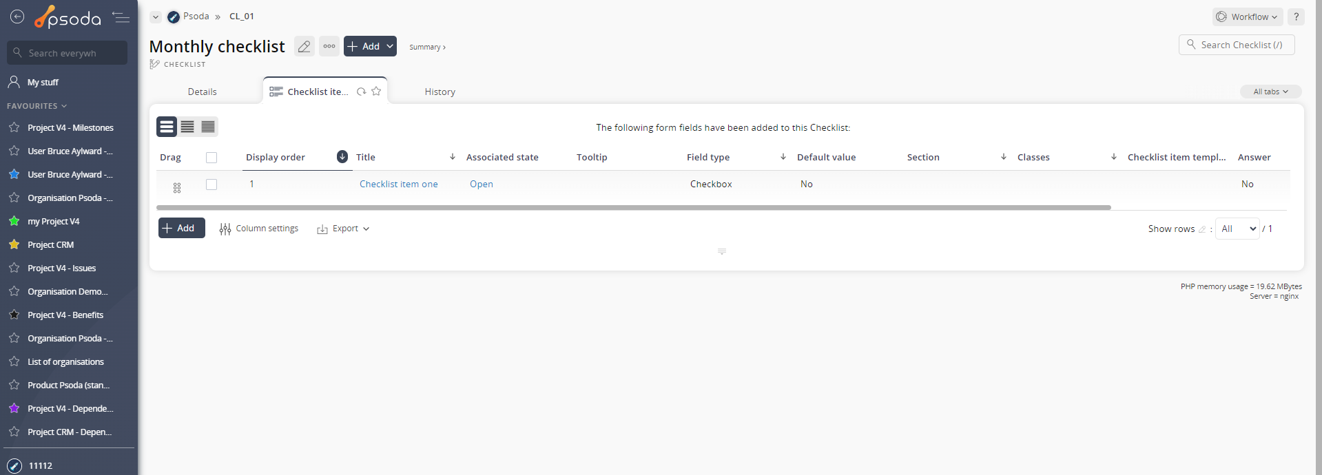
Figure 2 – Checklist checklist items tab
Checklists name tab
This tab will appear if the checklist is not a template. This is where you are able to fill out the checklist itself. The checklist items the are applicable will appear here to be filled out.
Figure 3 – Checklist name tab
Once you have set up a checklist template, you will also get extra views on the applicable asset you selected when creating the template checklist. If your checklist template is set to not allow multiple. If the template checklist has Include as tab ticked you will also get a new tab on the applicable asset with the name of the template checklist: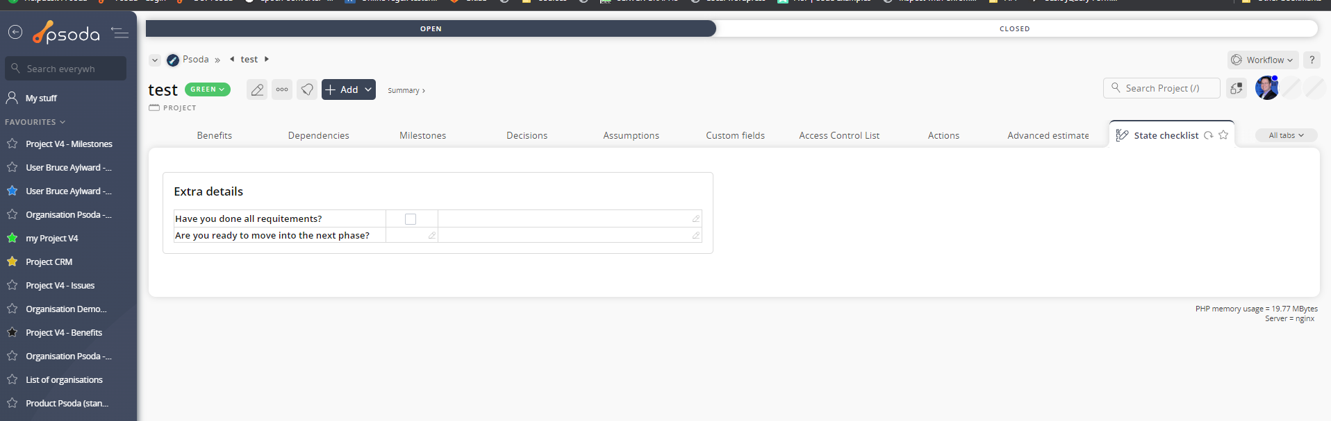
Figure 4 – Single checklist appearing as new tab on a project
And also a new dashlet with the name of the template checklist will be available on your dashboard: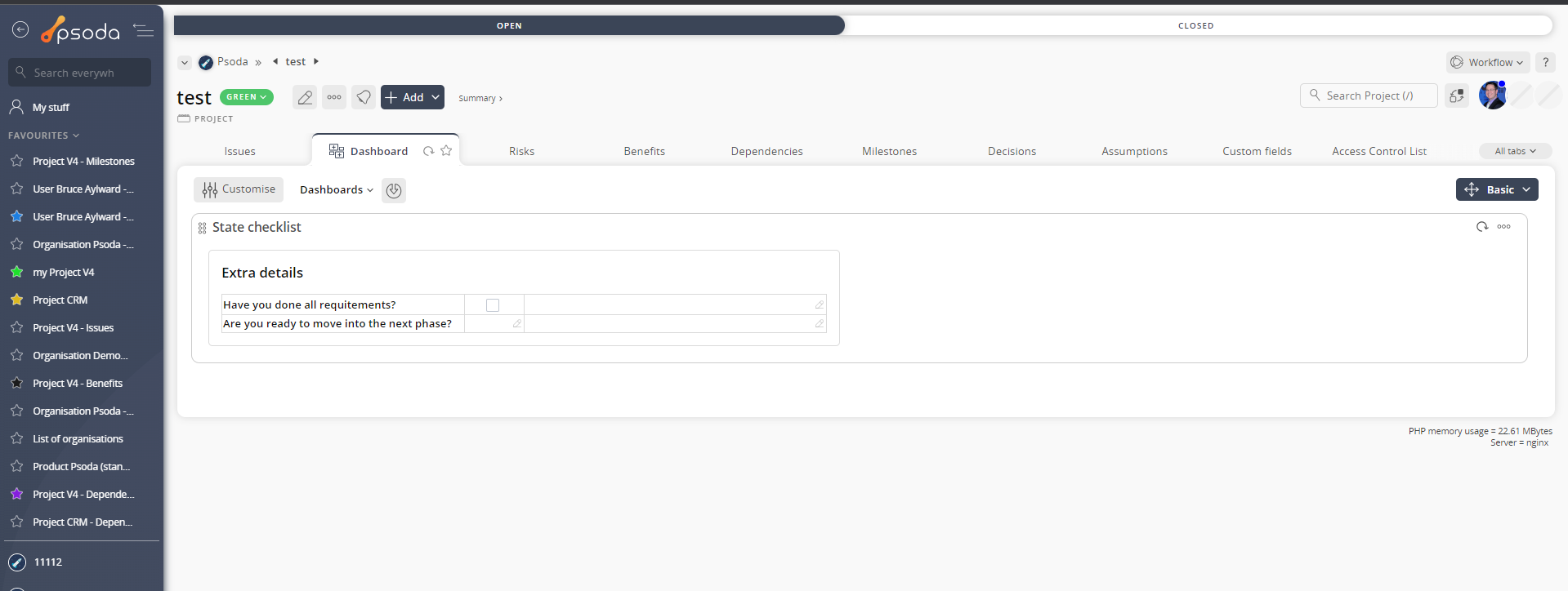
Figure 5 – Single checklist appearing as new checklist on a project
If your checklist template is set to allow multiple. If the template checklist has Include as tab ticked you will also get a new tab on the applicable asset with the name of the template checklist: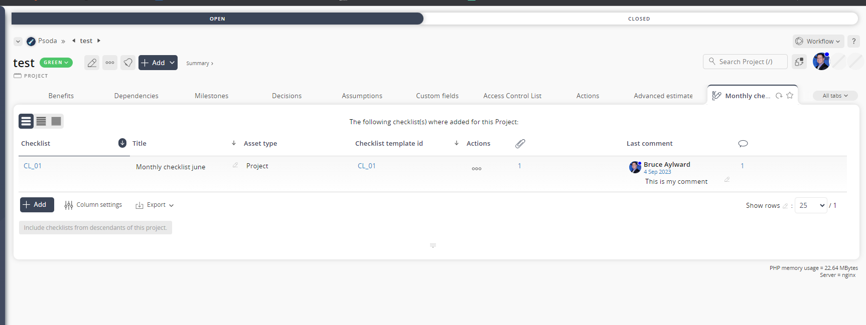
Figure 6 – Allow multiple checklist appearing as new tab on a project
And also a new dashlet with the name of the template checklist will be available on your dashboard: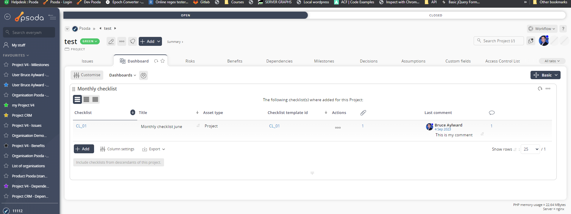
Figure 7 – Single checklist appearing as new checklist on a project
Details
This tab shows additional details for the selected checklist including the Checklist template id, whether or not this checklist is included as a tab or a dashlet, whether multiple of this checklist is allowed, classes which is the asset this applies to , the applicable workflow ID, and the object ID, as shown in Figure 8.
Figure 8 – Checklist details tab
 History
This tab shows shows some basic history of the checklist, as shown in Figure 9. By default, this tab will present you with a number of details about the checklist’s history such as the creation date, creation user, last update date and last update user. If the checklist has been changed then this section will also show a table of all the changes that has been made, including the date of each change, the field changed, the value before the change and the user who made the change.
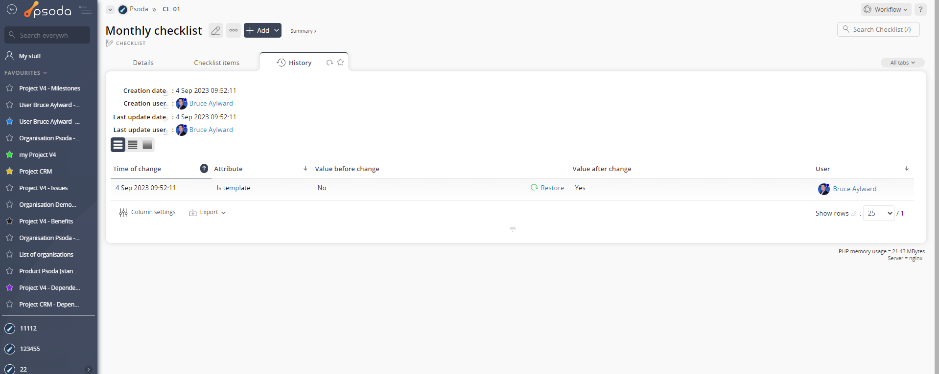
Figure 9 – Checklist history tab
 Comments
This tab shows an asset listing of all of the comments that  users have made on this checklist, as shown in Figure 10. By default, this table will present you with a number of details about the comments such as, the date that this comment was last updated, who created the comment, the comment itself and any associated tags to name a few.
From the Actions column of this comments table, you can act on individual comments by editing or deleting the selected comment.
users have made on this checklist, as shown in Figure 10. By default, this table will present you with a number of details about the comments such as, the date that this comment was last updated, who created the comment, the comment itself and any associated tags to name a few.
From the Actions column of this comments table, you can act on individual comments by editing or deleting the selected comment.
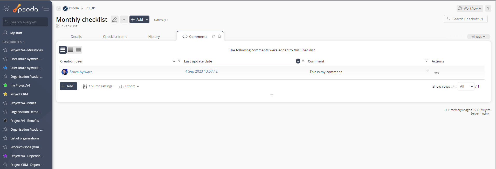
Figure 10- Checklist comment tab
 Attachments
This tab shows an asset listing of all of the attachments that have been added to this checklist, as shown in Figure 11. By default, this table will present you with a number of details about the attachments such as the file’s name, attachment type, view the version and access a download link.
From the Actions column of this attachments table, you can act on individual attachments by editing, deleting, moving or  locking/
 unlocking the selected attachment.
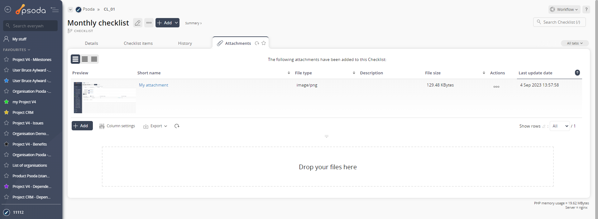
Figure 11 – Checklist attachments tab