The  risk distribution chart can be accessed at any of the parent view pages (e.g.
  organisation,
  programme, project,
  sub-project, or
  change request) via the Risk distribution tab and shows a plot of all the risks on at that level.
An example of the risk distribution chart at the organisation level is provided in Figure 1.
change request) via the Risk distribution tab and shows a plot of all the risks on at that level.
An example of the risk distribution chart at the organisation level is provided in Figure 1.

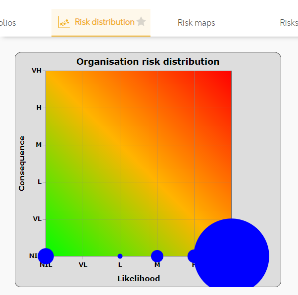
Figure 1 – Risk distribution chart
The vertical axis of the chart shows the percentage consequence (impact) a risk will have and the horizontal axis shows the likelihood (probability) that the risk will occur. A disk is plotted where each risk falls against these two axis. If more than one risk falls at a particular point then the disk size increases. The charts background shows a graded colour scale from red through amber to green to help visualise a risk’s overall risk factor.