The Schedule Gantt Chart provides a gantt chart that is attached to the side of the schedule table.
This way we can utilise all the features of the schedule table while providing a visual representation of the data via the gantt chart.
The gantt chart can be enabled on the schedule tab on a ![]() programme,
programme, ![]() project,
project, ![]() sub-project, or
sub-project, or ![]() task group using the button shown in Figure 1.
task group using the button shown in Figure 1.
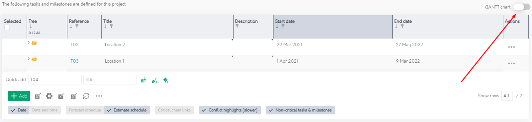
Figure 1 – Enable Schedule Gantt
Assets in the table are represented on the gantt along a timeline with the left and right positions corresponding to the start and end dates of the asset. Figure 2 provides an overview of all the different features on the gantt chart with additional explanations below.
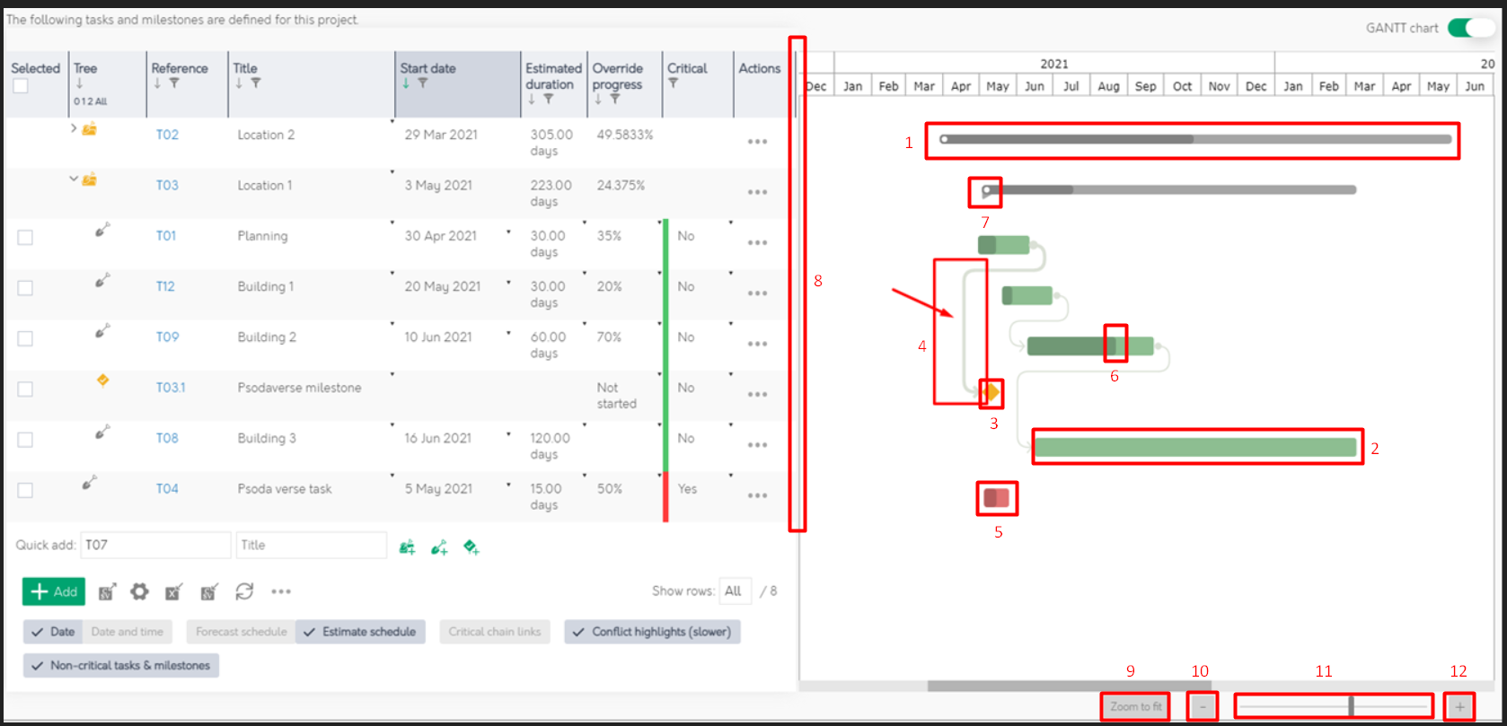
Figure 2 – Schedule Gantt Overview
| 1. | Taskgroups are represented by thin grey bars |
|---|---|
| 2. | Tasks are represented by thick green bars |
| 3. | Milestones are prepresented by yellow diamonds |
| 4. | Links between assets are represented by lines with arrows showing the direction of the link. These lines can be hovered or clicked on to be highlighted |
| 5. | Any critical assets will be shown in red |
| 6. | The progress of an asset is represented by the shaded area |
| 7. | This tag at the start of the taskgroup shows that its children are currently visible |
| 8. | The area between the table and the gantt can be dragged to resize the table and gantt |
| 9. | This button will zoom the gantt so that all the assets are visible |
| 10. | This button will zoom out |
| 11. | This slider can be dragged to zoom in and out |
| 12. | This button will zoom in |