Figure 8 below shows the top header area of the page:
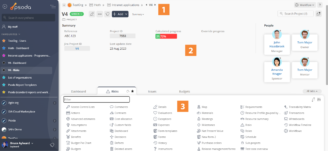
Figure 1 – Top header area
This area is split into three:
|
The current location shows you which item you are currently working on as well as options for this item. In Figure 1 we are currently viewing a project called Project V4.
At the top of the screen you will see the workflow (if available) with the dark coloured state as the current state this item is in. Underneath that, you will see the breadcrumbs. This shows you where this item is located. In Figure 1, Project V4 is located in the programme Intranet Applications, which is located in the programme Hoth, which is located in the organisation DemoOrg. These are all clickable to go to that level. Sometimes you will see icons just before and/or after the name of the item you selected. These icons allow you to go directly to the next or previous items. Underneath that, you will see the title of the asset as well as multiple options. The options you might see are the  edit pencil (to edit the item), the edit pencil (to edit the item), the  three-dot options menu (to give you options such as deleting the item), the three-dot options menu (to give you options such as deleting the item), the  follow button (to follow this item), the follow button (to follow this item), the  add button (to add something to this item), the details button (to toggle the details box explained below), the search bar (to filter on this page or search throughout this item) and the people assigned to this item (hover to see their name and role). add button (to add something to this item), the details button (to toggle the details box explained below), the search bar (to filter on this page or search throughout this item) and the people assigned to this item (hover to see their name and role).
|
|
The details box contains summary information about the item that you are viewing for example the project reference number and when someone last updated something on this item. In some areas, you may see summary information displaying the workflow that have been applied to the asset being viewed. |
|
The rest of the top header area is taken up by different tabs. Each tab displays different information related to the item that you are currently viewing. In our example above the Actions tab will display all of the actions that are allocated to this particular project. If there are more tabs available that are not being displayed at the moment there will be a drop-down icon located at the far right of the tabs. Click on this icon to get a drop-down list of additional tabs that you can view, in Figure 1 this drop-down is selected to illustrate this. There may also be an  Edit tabs option that allows you to select which tabs you want visible and the order you’d like them in, alternatively you can utilise the drag and drop function.
To reorder your tabs or put tabs from this drop-down list into your always visible tabs, you can use the drag and drop. Click and drag the tab you want to move from the drop-down list and drop it where you would like it (next to a visible tab). This will automatically save where that tab is dropped and always show it. If you want to remove a tab, hover over the tab and press the X button and it will remove it from your visible tabs.
You can set additional options for your tabs in your user preferences. Edit tabs option that allows you to select which tabs you want visible and the order you’d like them in, alternatively you can utilise the drag and drop function.
To reorder your tabs or put tabs from this drop-down list into your always visible tabs, you can use the drag and drop. Click and drag the tab you want to move from the drop-down list and drop it where you would like it (next to a visible tab). This will automatically save where that tab is dropped and always show it. If you want to remove a tab, hover over the tab and press the X button and it will remove it from your visible tabs.
You can set additional options for your tabs in your user preferences. |